
Power App Starter Kit
Power Platform Portfolio powerapps component library low-code alm Take a look at my starter kit for rapid canvas app development, with a customizable theme design, fly-out menu, pop-up dialog, panel, coachmark and much more. With this solution, you can quickly start developing your business value without worrying about the basics like; theme designs and custom components. Which you probably need in pretty much every tablet canvas app. And the best part, you can use it without an additional Power Apps license.
Note: Standard license designation; An app that only uses standard connectors. Which means, an end user must have Power Apps included with Office 365 plan, Per App Plan, or a Per User Plan to access this app.
Tip: You're free to use this starter kit for your own projects. If you have any questions, please contact me and I will be happy to assist you.
Features
- Customizable theme
- Pre-defined themed controls
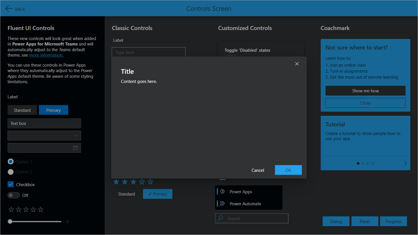
- Pre-defined themed component library with:
- Fly-out Menu
- Pop-up Dialog
- Pop-up Panel
- Header w/ OnSelect behavior (.SVG icons)
- Loading Spinner
- Progress Bar
- IconSVG w/ OnSelect behavior (.SVG)
- SearchBox w/ OnSelect behavior
- Coachmark
- Coachmark Carousel
- Coachmark Carousel w/ Illustrations
- Custom themed controls (HTML styles) with:
- Shadow boxing
- Gradient cards
- Border radius
- .SVG icons
- Light and dark mode switch w/ darkMode variable
This solution package is inspired on community samples that demonstrate different usage patterns for Power Apps. I combined some of the samples with my own enhancements and created this app as a startup template solution for new projects.
Theme designer
The color palette is based on Microsoft’s Fluent UI Theme Designer and is fully customizable by acting on the variable called appTheme.palette which is initialized in the OnStart event of the App.
All mentioned controls in the theme.json file are based on the appTheme.palette variable defined in the app OnStart, which is linked to the default Blue standard theme.
Set(
    themePalette,
    If(
        !darkMode,
        {
            themePrimary: "#1b79b0",
            themeLighterAlt: "#f3f9fc",
            themeLighter: "#d1e6f2",
            themeLight: "#acd2e7",
            themeTertiary: "#66a9d0",
            themeSecondary: "#2f87b9",
            themeDarkAlt: "#186d9e",
            themeDark: "#145c86",
            themeDarker: "#0f4463",
            neutralLighterAlt: "#faf9f8" ...

            >>> Hidden due to readability <<<
        }
    )
);
Set(
    appTheme,
    {
        palette: themePalette,
        borders: {
            input: {
                style: "Solid",
                thickness: 1,
                focusedThickness: 1,
                radius: 0
            },
            button: {
                style: "Solid",
                thickness: 0,
                focusedThickness: 0,
                radius: 0
            }
        },
        fonts: {
            default: "'Segoe UI', 'Open Sans', sans-serif",
            size: {
                xs: 9,
                s: 10.5,
                m: 12,
                l: 16,
                xl: 20
            },
            headings: {
                h1: 24,
                h2: 20,
                h3: 14,
                h4: 12
            }
        }
    }
)
Themed controls
Button, Text Input, Pen Input, Dropdown, Combobox, Date Picker, Listbox, Checkbox, Radio, Toggle, Slider, Rating, Timer, Forms, Rich Text Editor, Label, HTML Text, Forms Pro survey, Data Table, Gallery, Image, Camera, Barcode Scanner, Video, Microsoft Stream, Audio, Microphone, Add Picture, Import, Export, PDF Viewer, All Shapes, All Charts.
Preview light theme
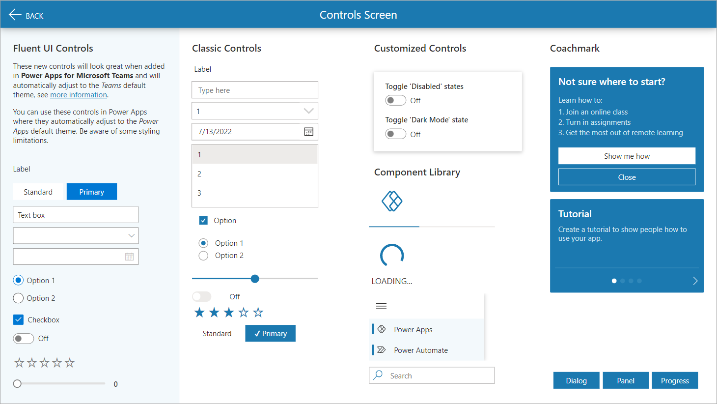
Light theme
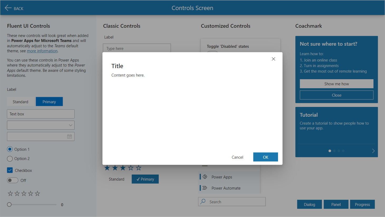
Light theme w/ dialog
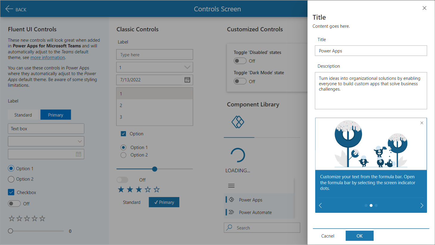
Light theme w/ panel
Preview dark theme
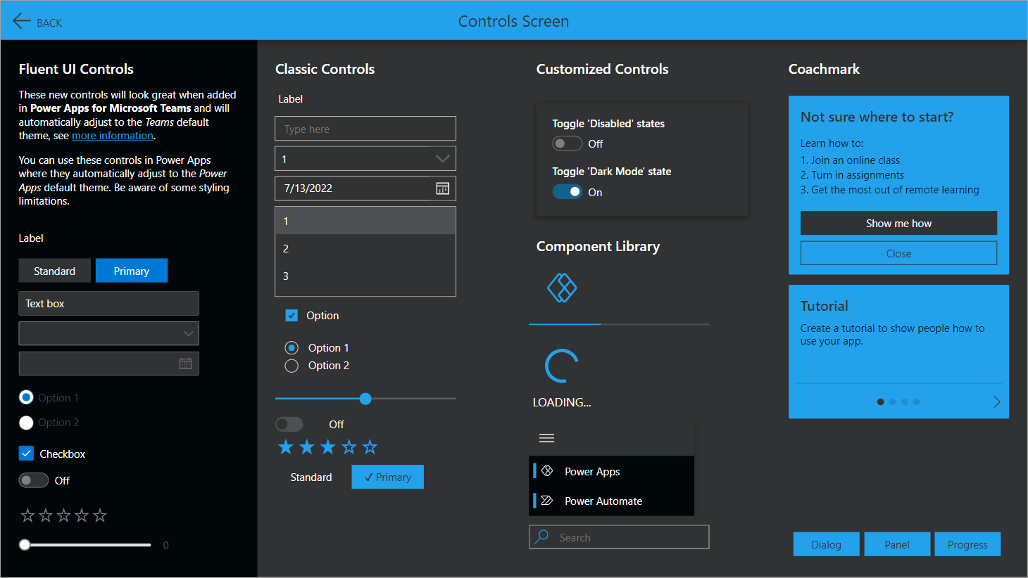
Dark theme
Dark theme w/ dialog

Dark theme w/ panel